Per Nimer, jury member at the Color in Architecture Competition, discussed with us the color functions, the buidlings he admires and what he expects to see from the participants in this under-40 contest, organised by AkzoNobel and Archisearch!
Per, thanks for being with us today. So, what is the main job of a colour expert in AkzoNobel?
To work with colour of course… We sell paint in many ways, shape and form but what people and architects buy, is colour. When an architect prescribes an Akzo Nobel paint or powder, they take for granted that it is the best quality for the purpose and they do not worry much about that, so the concern often lands with colour, this is the best colour for their project. On an everyday basis a color expert can be making colour collections, giving lectures or any other colour and design related issue. Often also helping customers, and this can include anything, from a consumer to an architect to a car designer, with colour choices.
What qualities can be brought to a design artifact, such as an interior space or a façade, when colours are deployed?
(Almost) any quality you want, which is what makes colour so interesting. Colour is what we see first, we recognize colour before shape and colour gives the biggest impression in a room. If you want the space to feel warm, cool, intense, spacy or any other feeling, you can almost always achieve this with colour. Colour can be many different things. A red bicycle could make it a girl’s bike, red on a car makes it hot and fast, red in a bedroom makes it warm and inviting and red on a traffic light means danger…

Why do you think the majority of architects seem to be afraid of colours?
Part of the problem is the education, architectural universities focus on shape and thus, colour will interrupt that shape. If you have very little training in colour and you know how big impact it has, you would be reluctant to use it I think. You can have a mediocre building or space and make it very interesting with the right use of colour, of course this means that you can have a beautiful building and totally ruin it with the wrong choice of colour…

Which contemporary buildings encompass the ideal use of colour according to your personal taste?
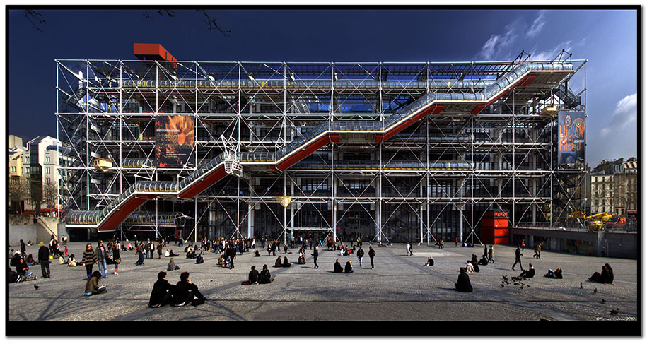
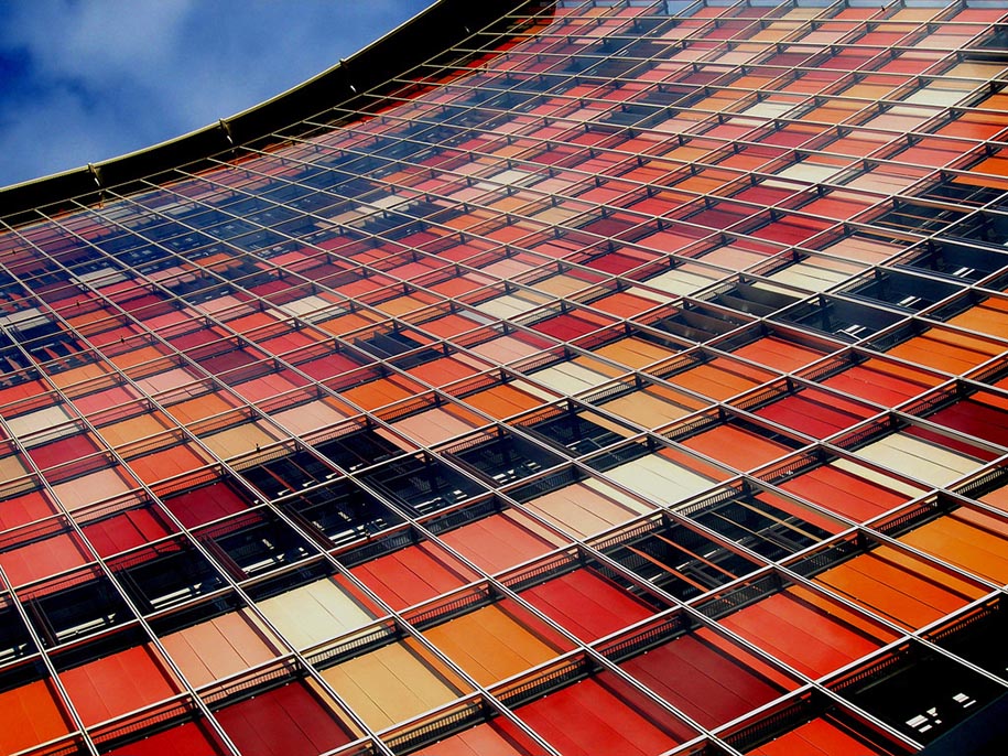
Personally I really like it when colour is an integral part of the design process, not when colour is used as an afterthought, like; “this is boring, I think we need colour”… Centre Georges Pompidou by Piano and Rodgers is such an example, I think, and a pioneering way of using colour. The Barajas airport, by Rodgers, also shows a functional and directional colour use that is interesting. You will also have to admire Sauerbruch Huttons first pixelated building in Berlin.

What do you expect from the architects that will participate in Color in Architecture competition? Taking into account the individual character of the Greek urbanscape, do you have any tips for them on how to use colours?
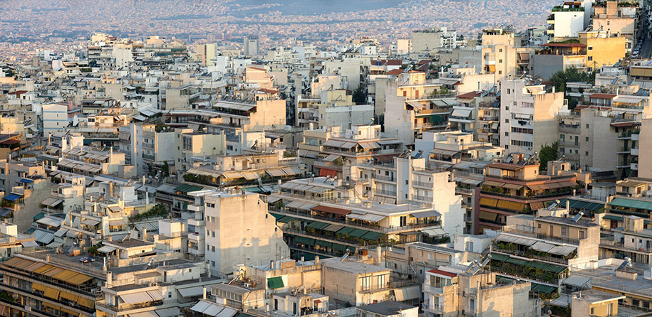
I have visited Athens many times and admired the old culture and architecture that is present there. Like most older cities, I think Athens is a very material city, meaning not many colours but instead a variation of materials and colour in a very harmonic way. It would be interesting to see how new and modern architecture can coexist and harmonize with this and also use colour as part of the design.
Thank you Per!
Cover image: Madrid Barajas International Airport, designed by Richard Rogers
