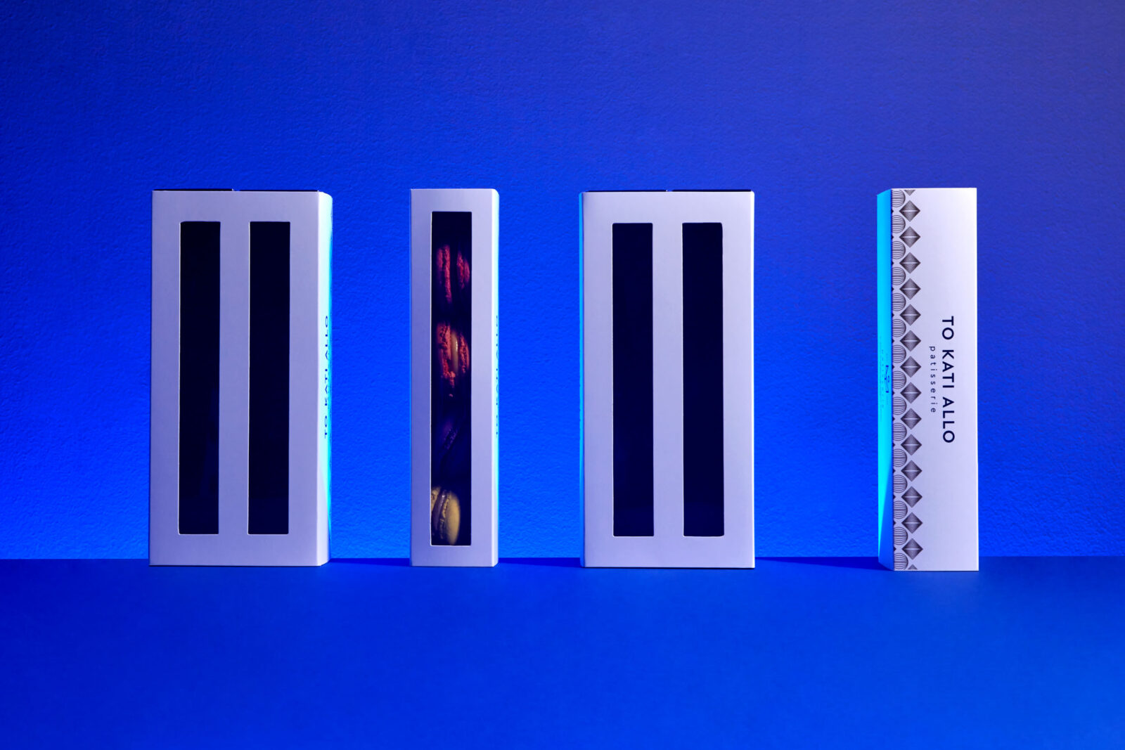
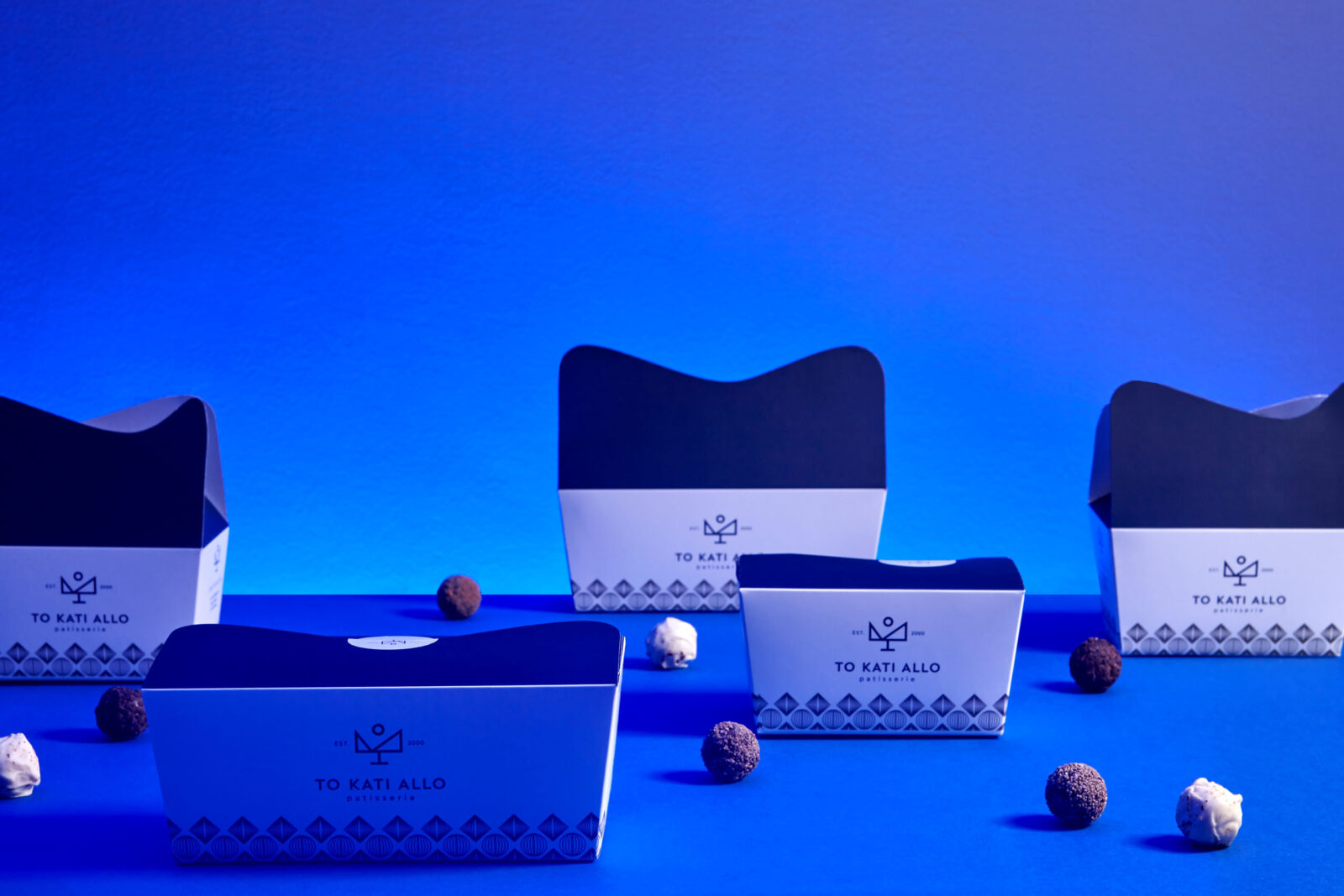
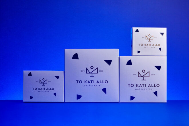
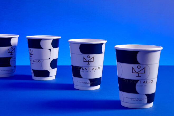
Creating the visual identity of the “TO KATI ALLO” patisserie, Cursor Design Studio expressed the visual aspect of the brand with clean design and geometrical forms, wanting to highlight that – in baking art as well – simplicity does not limit creativity. Within this framework the most restrictive challenge was the demand for balance between the austere and the sweet.
-text by the author
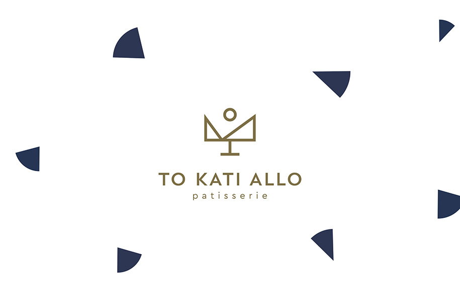
The creation of the logo came from the combination fundamental geometrical elements to compose an innovative pastry landscape: a cornerstone, on which archetypical baking pieces are resting upon, peaking up to a glazed fruit-sun. The equally fundamental Latin capitals of the typography are supporting the geometry of the symbol.
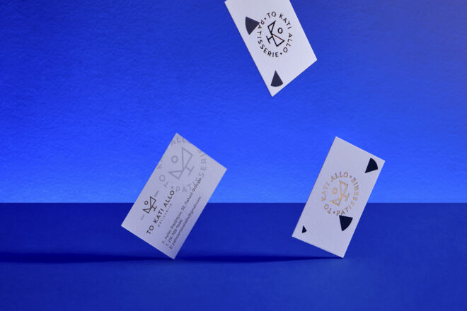
The philosophy of the brand developed on a series of visual communication applications, which are using pure white, deep blue and gold to frame up the brand and offer to both smooth and emboss surfaces a sense of prestige and sweet luxury.
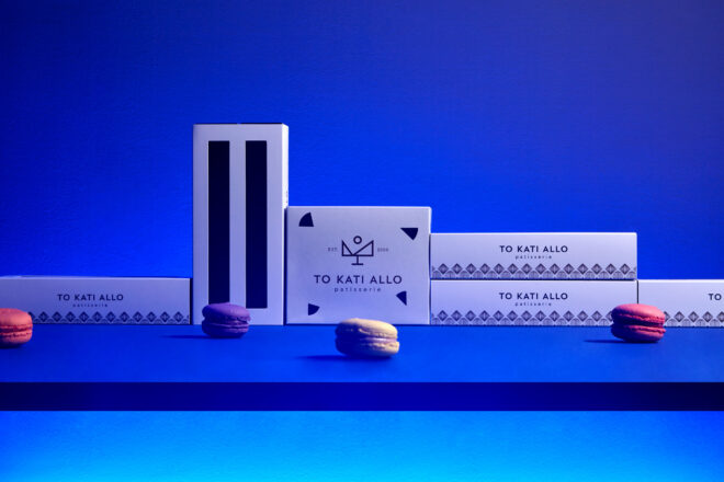
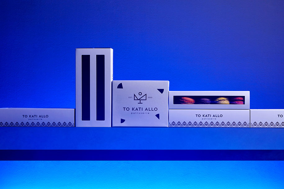
Extending the corporate ID, packaging obeys to the visual communication code of the brand, further enhancing its aesthetic and commercial aspects.
Making an alliance with the light and changing the scale and the angle of view we transformed the pastry landscape into a cityscape: brand is now composing a town full of candies. Low and high buildings, roundabouts and highways. A sweet state by the sea: welcome to KATI ALLO.
Credits & Details
Deigners: Cursor Design Studio
Location: Palaio Faliro/Athens
Type: logotype, corporate ID and packaging
Photography: Michael Koronis
