Architecture in Colour series treats colour as an architectural instrument rather than decoration—one that shapes space, proportion, and emotional experience as powerfully as form and light.
A 1950s panel-building apartment in Prague is completely reimagined by B² Architecture for a young family, opening its originally constrained layout into an open and airy home. A central green core organizes daily life, around which living and private zones respond to orientation and views, fostering connection within the apartment and to the outside city. Along with the green, accents of blue and pink articulate different areas and moods, tracing the revealed structural system. The design emphasizes adaptability and spatial clarity, offering a generous framework for living, working, and growing together.
The renovation reconfigures a typical apartment within a 1950s panel building into a contemporary family home defined by openness, clarity, and spatial flexibility. Taking advantage of the building’s generous footprint and skeletal structural system, B² Architecture removed the majority of the existing partitions, replacing a fragmented arrangement of rooms with a more fluid and interconnected domestic landscape.
Rather than concealing the building’s construction, the intervention embraces it, allowing the original network of columns and beams to become a visible and defining component of the interior.
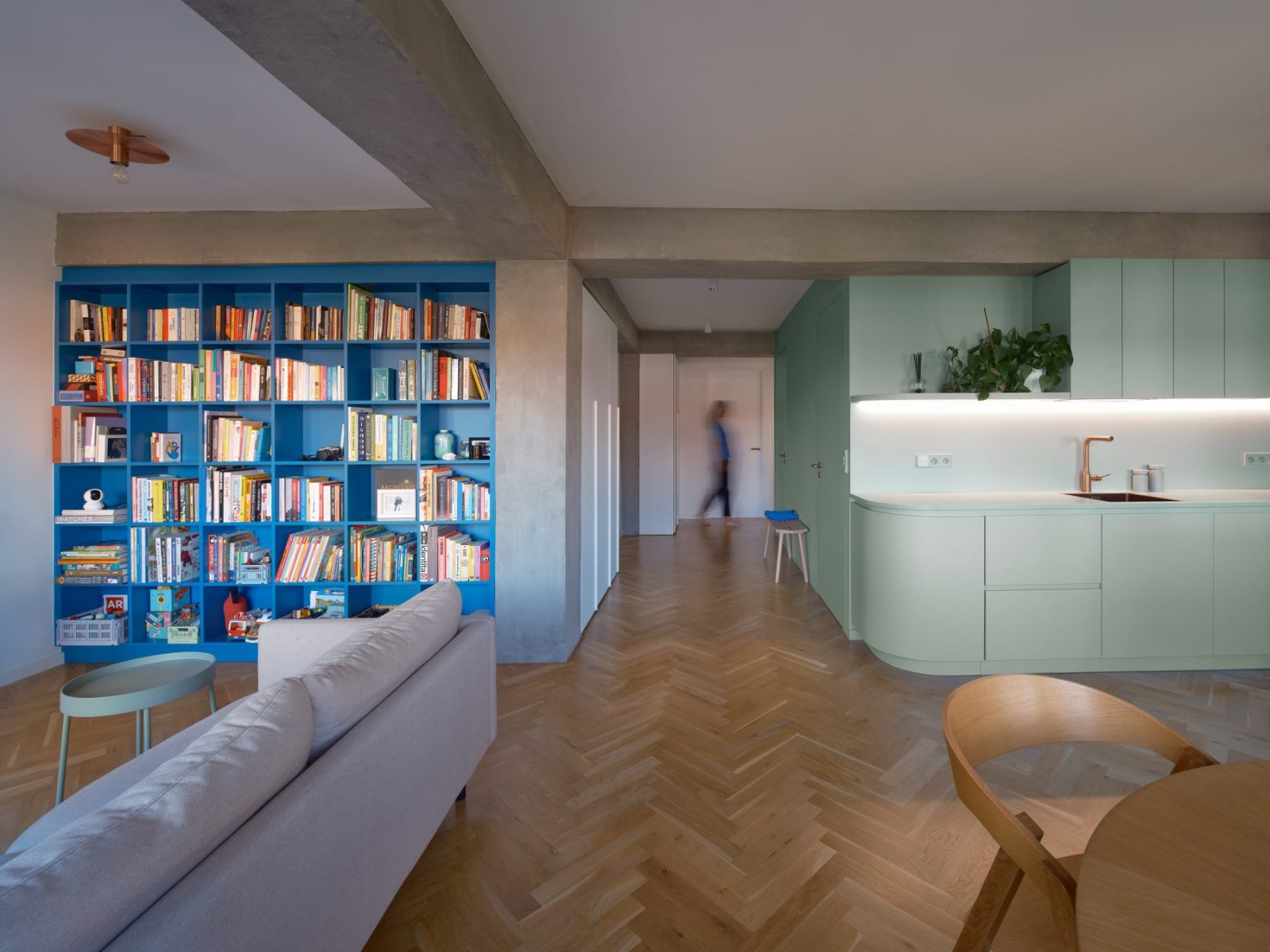
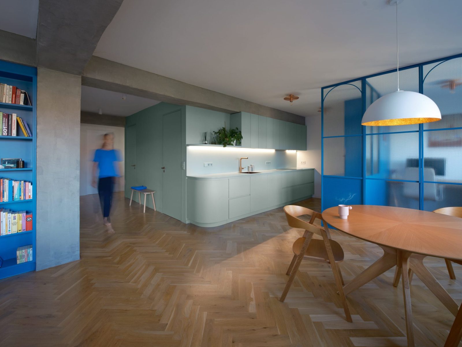
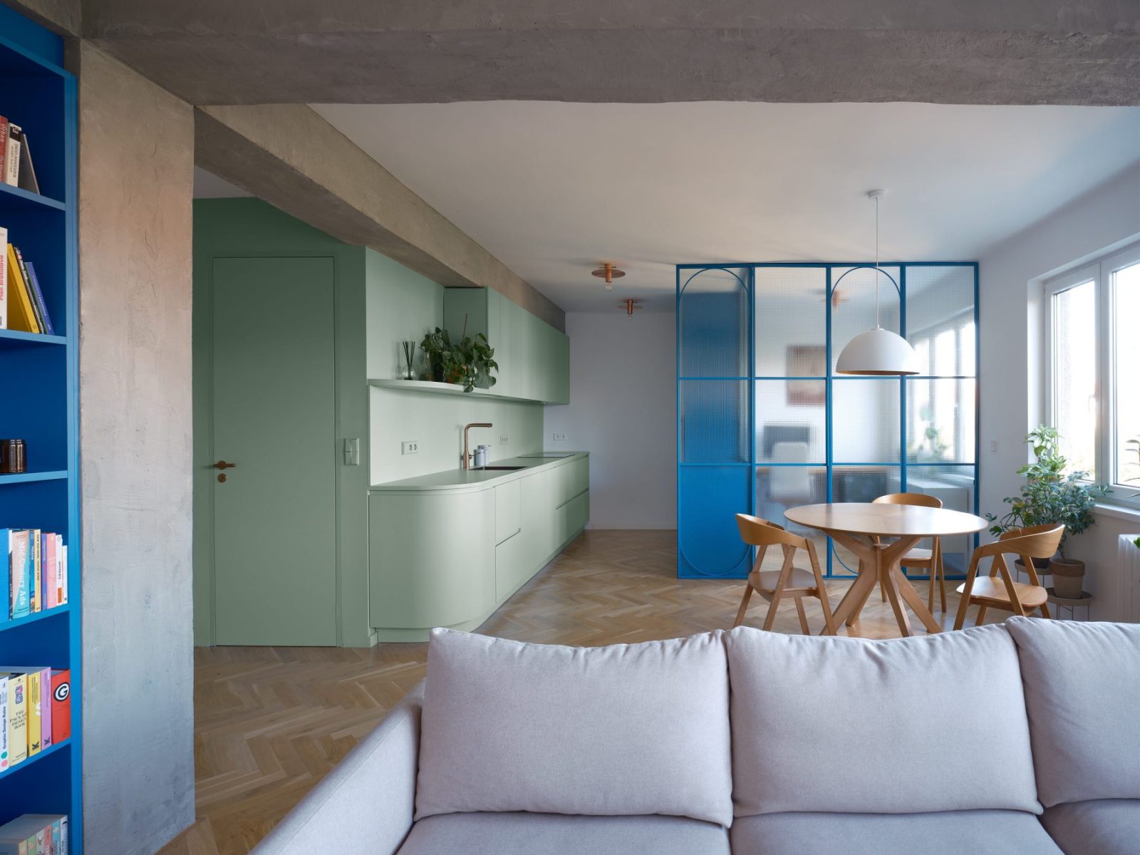
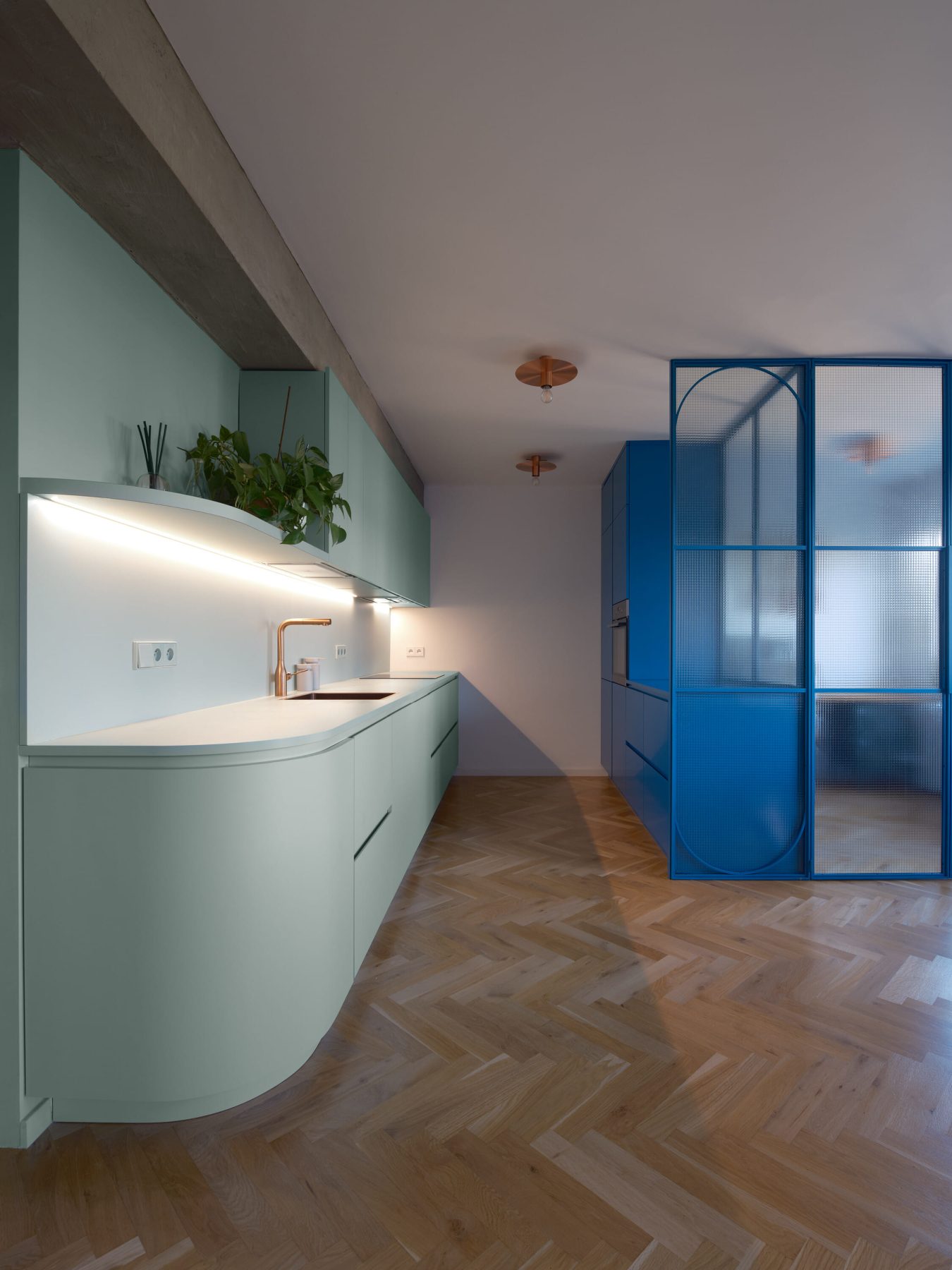
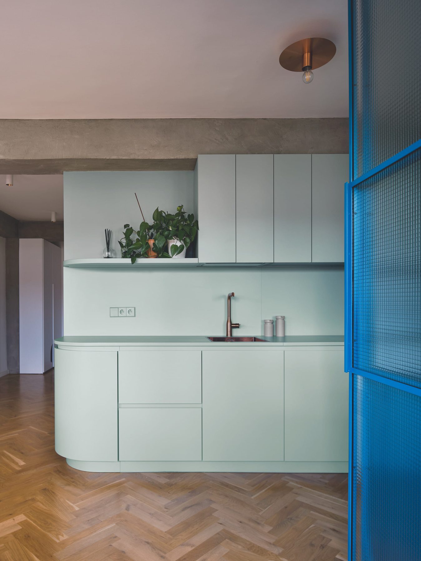
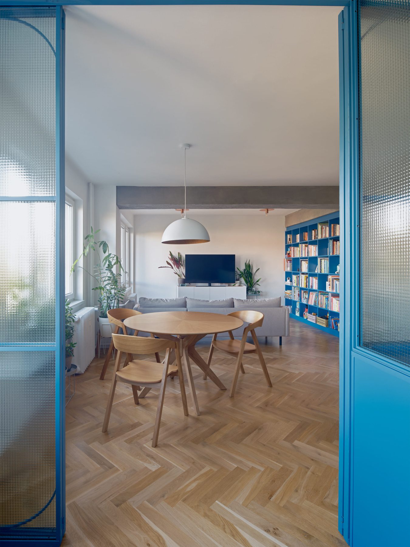
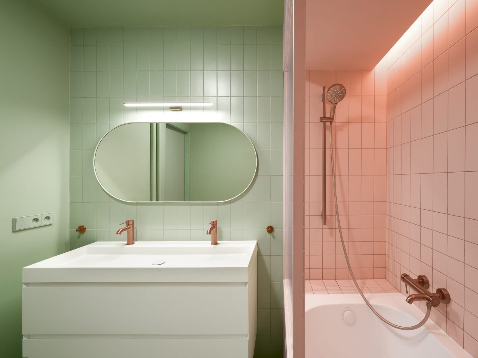
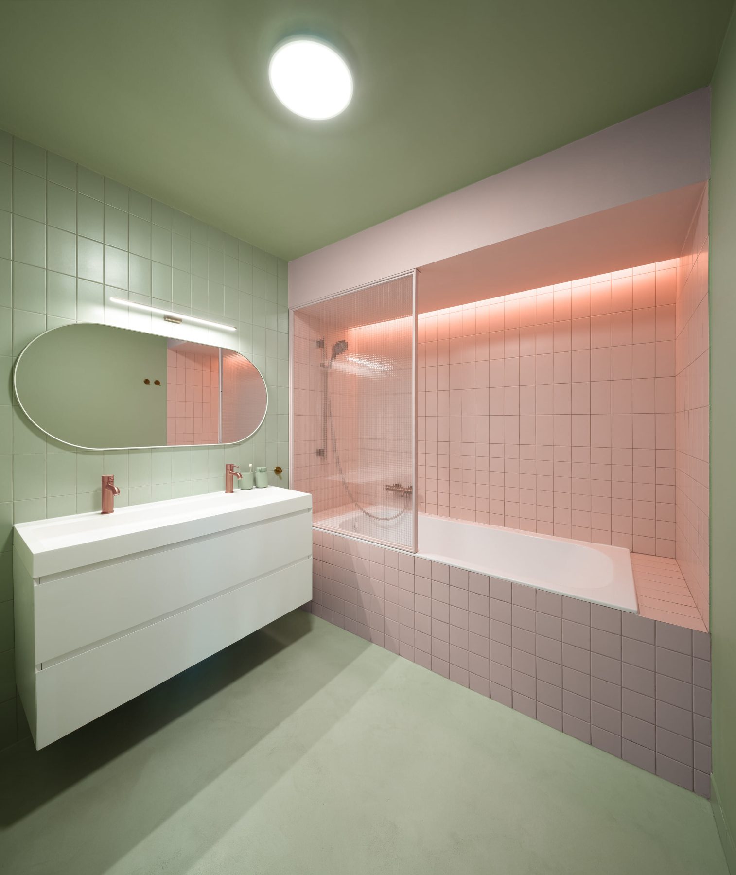
A carefully positioned service volume forms the organisational centre of the apartment. Clad in green, this compact core accommodates the bathroom and walk-in wardrobe while establishing a strong visual anchor around which daily activities unfold. The primary living spaces are arranged along the façade overlooking the city square, benefiting from natural light and expansive views, while the more private functions are oriented towards the quieter courtyard.
Colour plays a fundamental role in structuring the apartment’s spatial experience. Green, blue, and pink are deployed strategically to distinguish functions, establish hierarchy, and create a clear relationship between the various zones of the home.
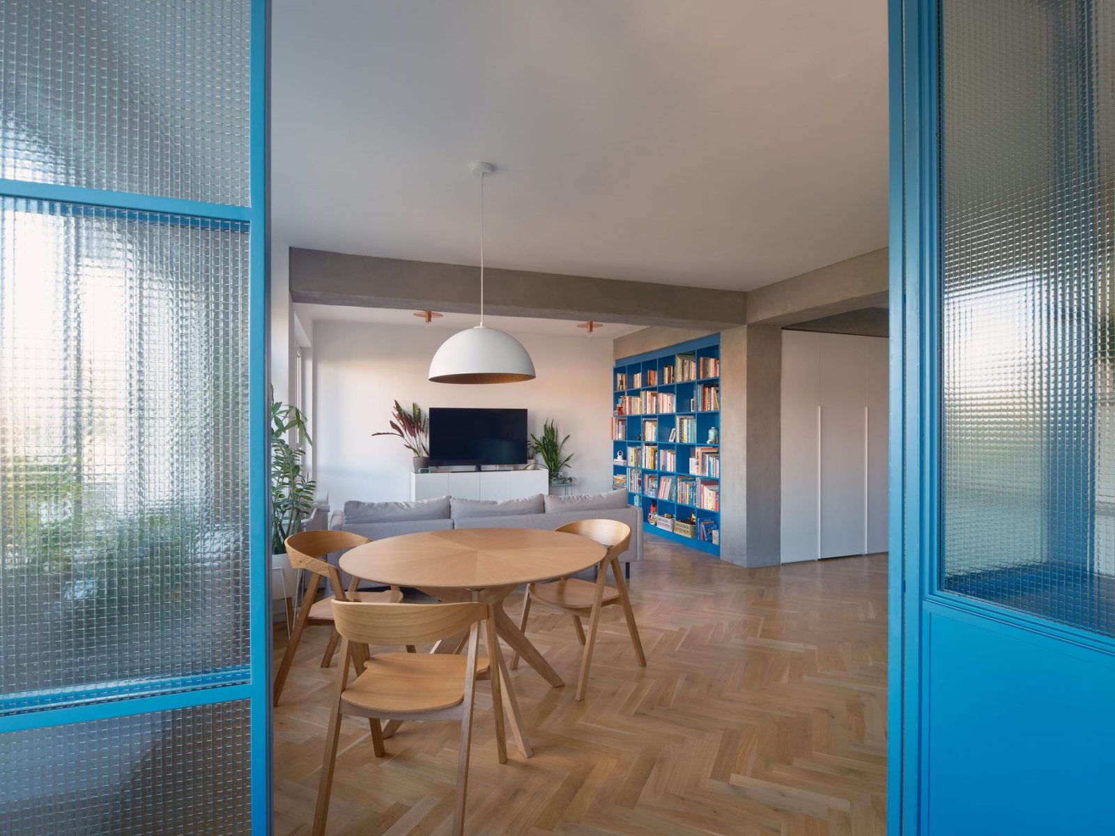
The green central volume acts as a landmark within the open plan, while a series of blue built-in elements define the study and library, introducing moments of concentration and retreat within the broader living environment. The third chromatic layer appears through carefully integrated pink surfaces, completing a palette that balances vibrancy with restraint. Together, these interventions create distinct spatial identities while maintaining a coherent overall composition.
The interaction between green, blue, and pink generates a dynamic domestic atmosphere.
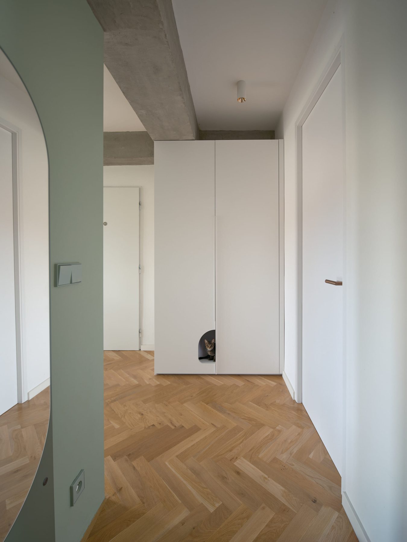
Transparent partitions further reinforce this sense of openness by delineating a dedicated workspace without interrupting visual continuity, while custom white cabinetry provides extensive storage and conceals secondary service functions.
Material choices reinforce the architectural clarity of the intervention.
Exposed concrete elements are paired with cement-based finishes and warm oak flooring, creating a neutral backdrop against which the colour strategy can unfold. Copper details, incorporated into fittings, door handles, and bespoke lighting fixtures, introduce moments of precision and tactility. The existing concrete beams were unified through a continuous cement screed finish that softens their presence and enhances the perception of height.
Three Shades of Home establishes a cohesive spatial narrative that articulates distinct functions while introducing character and a subtle sense of playfulness.
Facts & Credits
Title Three Shades of Home
Typology Interior, Apartment
Location Prague, Czech Republic
Area 85 m²
Status Completed, 2025
Architecture B² Architecture
Authors Barbara Bencova, Zuzana Bartasová
Photography Alexander Dobrovodský
Text by the authors