A warm wine bar restaurant designed by studiomateriality pursues the visitors to experience the marriage of past with the present.
-text by Zoi Parasidi
Just a few steps away from a bustling avenue of the city centre, the small pedestrian street of Heronda Street in Pagrati seems to differentiate from the typical images of the Attic cityscape. In this quiet alley stands to this day an elegant neoclassical house from 1890, that feels like a well-hidden secret of the city centre.
Arriving at street number 8, the visitor is facing a grey building completely unaware of what awaits him inside: a warm wine bar restaurant. The aim of the interior design was for the visitors to experience the marriage of past with the present as soon as they walk through the door of the neoclassical building.
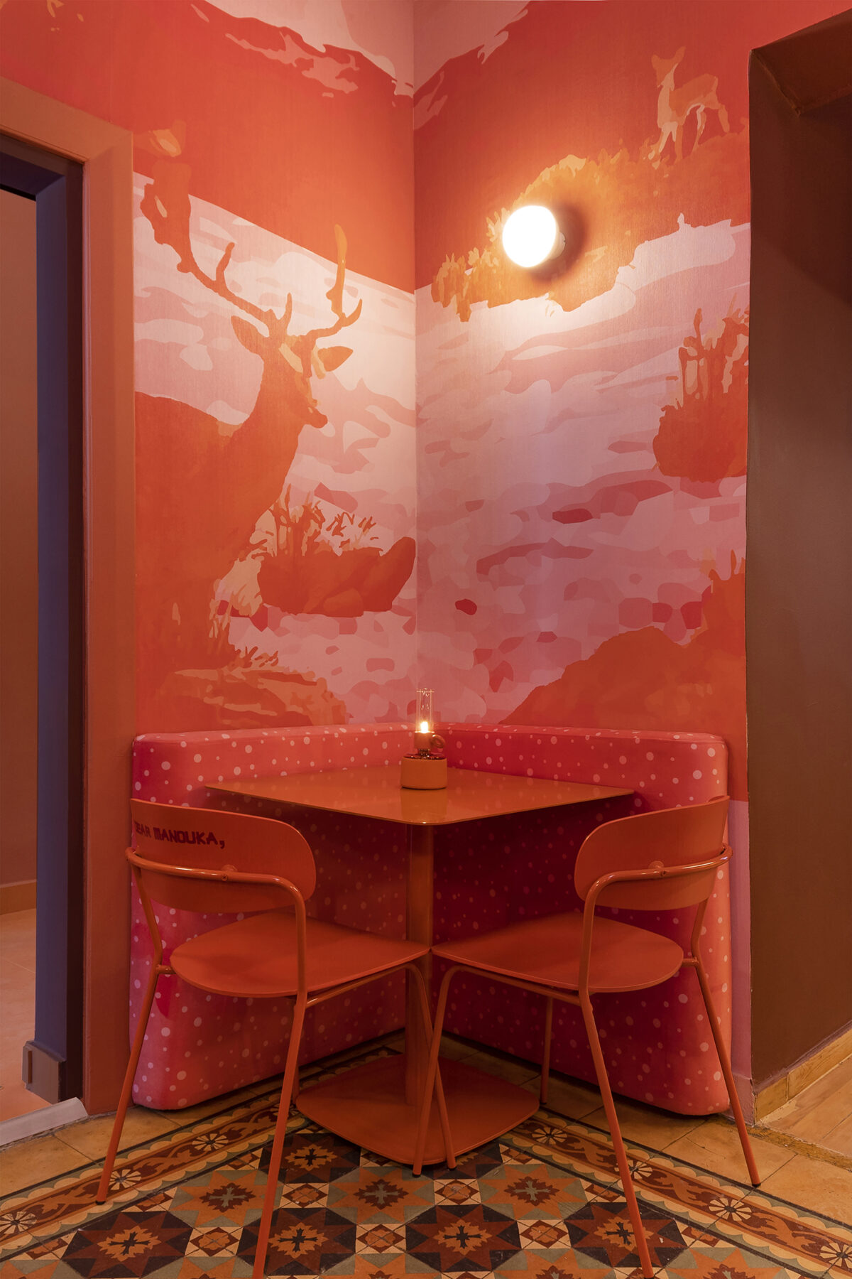
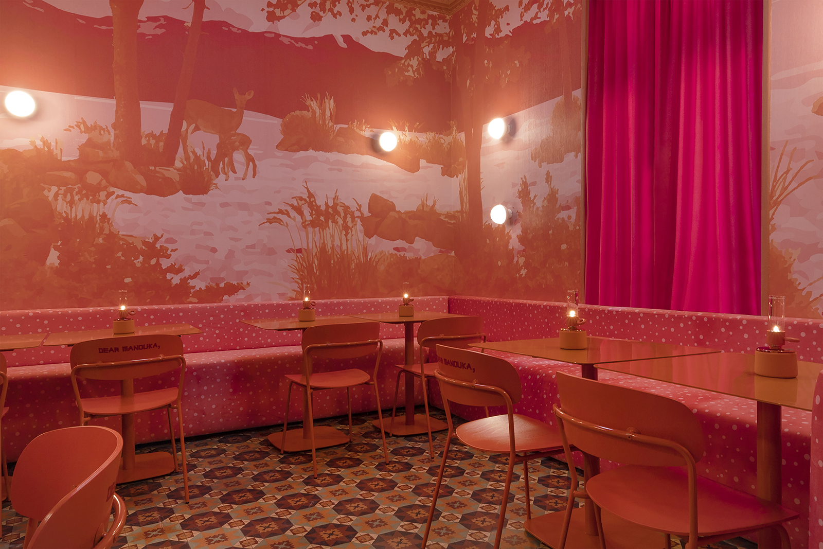
Building’s most beautifyl elements have been preserved, such as plaster decorations and cement tiles.
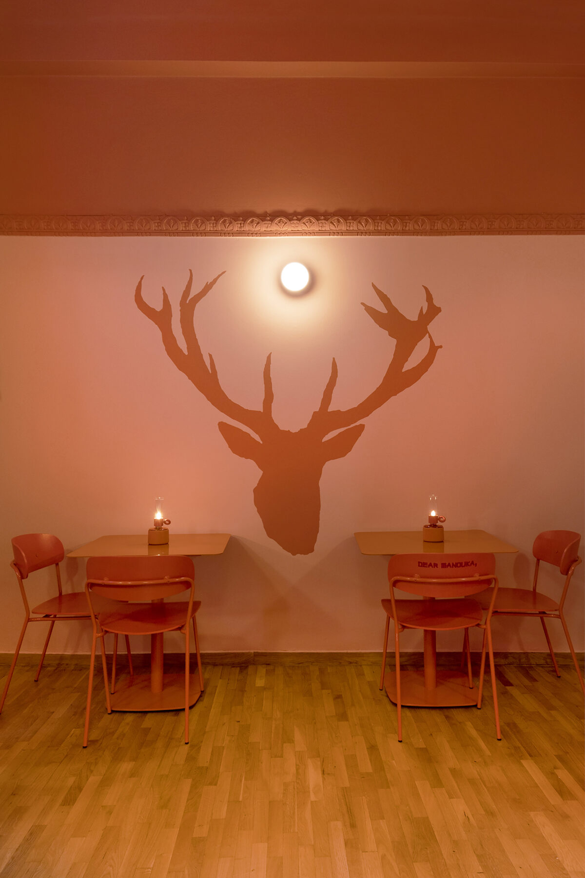
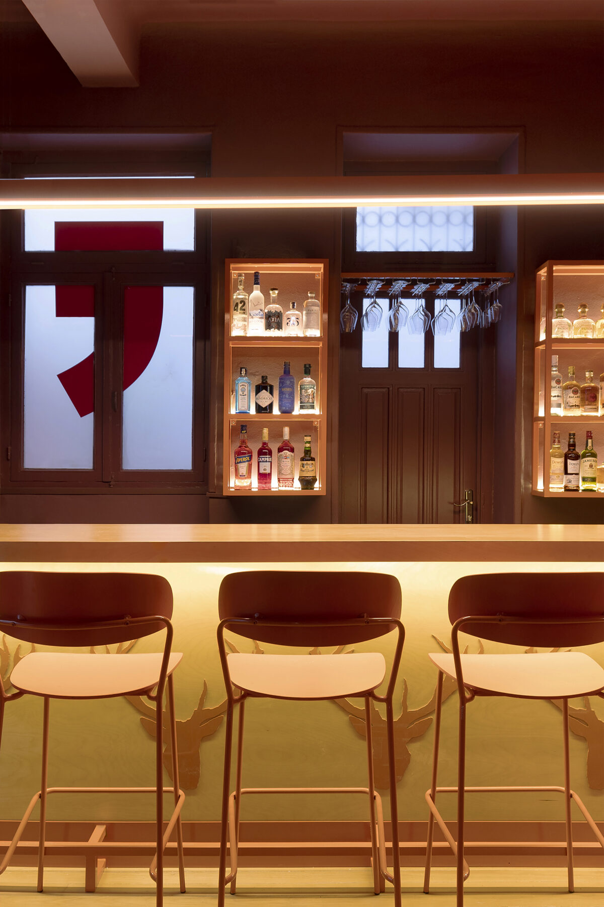
Respecting the history of the building that houses Dear Manouka, its most beautiful elements have been preserved, such as the plaster decorations on the roof and the traditional, colourful cement tiles on the floor. These elements are highlighted by the bright and warm colors chosen, and co-exist with different patterns and textures, all contributing to the maximalist image of the restaurant.
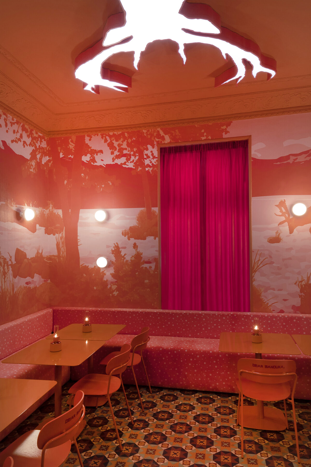
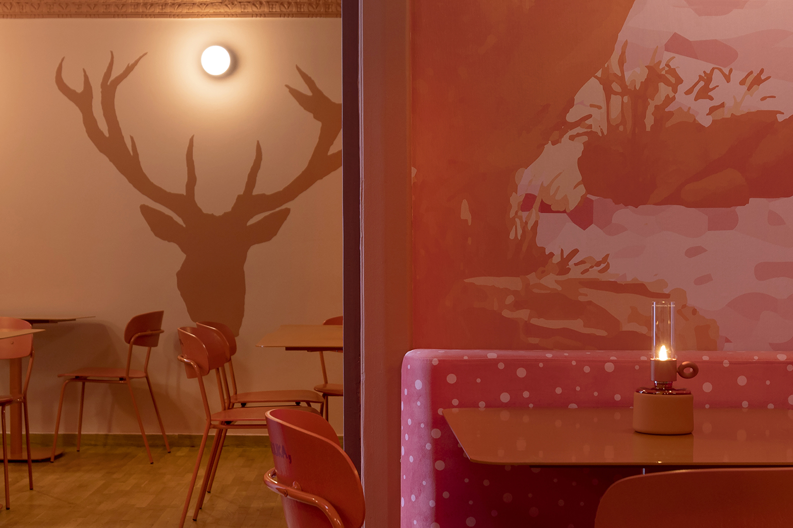
A naturalistic wallpaper is modernized thanks to the color palette.
A naturalistic wallpaper that could be imagined in an authentic country style room or could work as a forgotten frame in a village café is modernized, thanks to the color palette of the rooms, in which pink and orange shades play a leading role. The deers depicted in this wallpaper can be found in other parts of the space as well: they are part of the design of the bar. The outline of their head has become a light fixture in one of the rooms, letting off a pink neon light that comes from the ceiling. Sturdy curtains, custom velvet sofas and metal seats complete the interior of a building that contrasts sharply with its exterior.
As the cuisine of the restaurant has an exotic direction of fusion with Asian influences, the font used in the branding mimics the Japanese alphabet. In the space, visitors encounter the main tagline of the branding: “Dear Μanοuka, I’m always happy to cook for you” in fragments, as if they are reading parts of a letter addressed to someone – either themselves or any lover of the refined cuisine.

Facts & Credits
Title Dear Manouka
Typology Interiors, Design, Architecture
Location Heronda 8, Athens, Greece
Area 72 m2
Status Completed, 2023
Design studiomateriality
Lead Designer Miltos Kontogiannis
Design Team Margarita Vogiatzi, Thomai Tsimpou
Project Manager Serafeim Pappas
Photography Alina Lefa
Take a look at another project of studiomateriality, Recital, here !