Single Person Gallery in Shanghai designed by Offhand Practice creates the impression of being inside a cave by simulating the materiality of a cave and the way light penetrates.
When Offhand Practice first visited the former 60-square-meter street diner, they found a very long and narrow interior that gave them the impression that it could only be used as an art gallery or showroom.
In December, the client decided to use this venue for a vintage houseware gallery, named ‘Single Person’. Stochastically, this decision was coincided with the architects’ early intuition.
“During the initial communication phase, client directly sent us more than two hundred reference images to express their aesthetic preference, each one showing a different possible design direction”, tell us the architects.
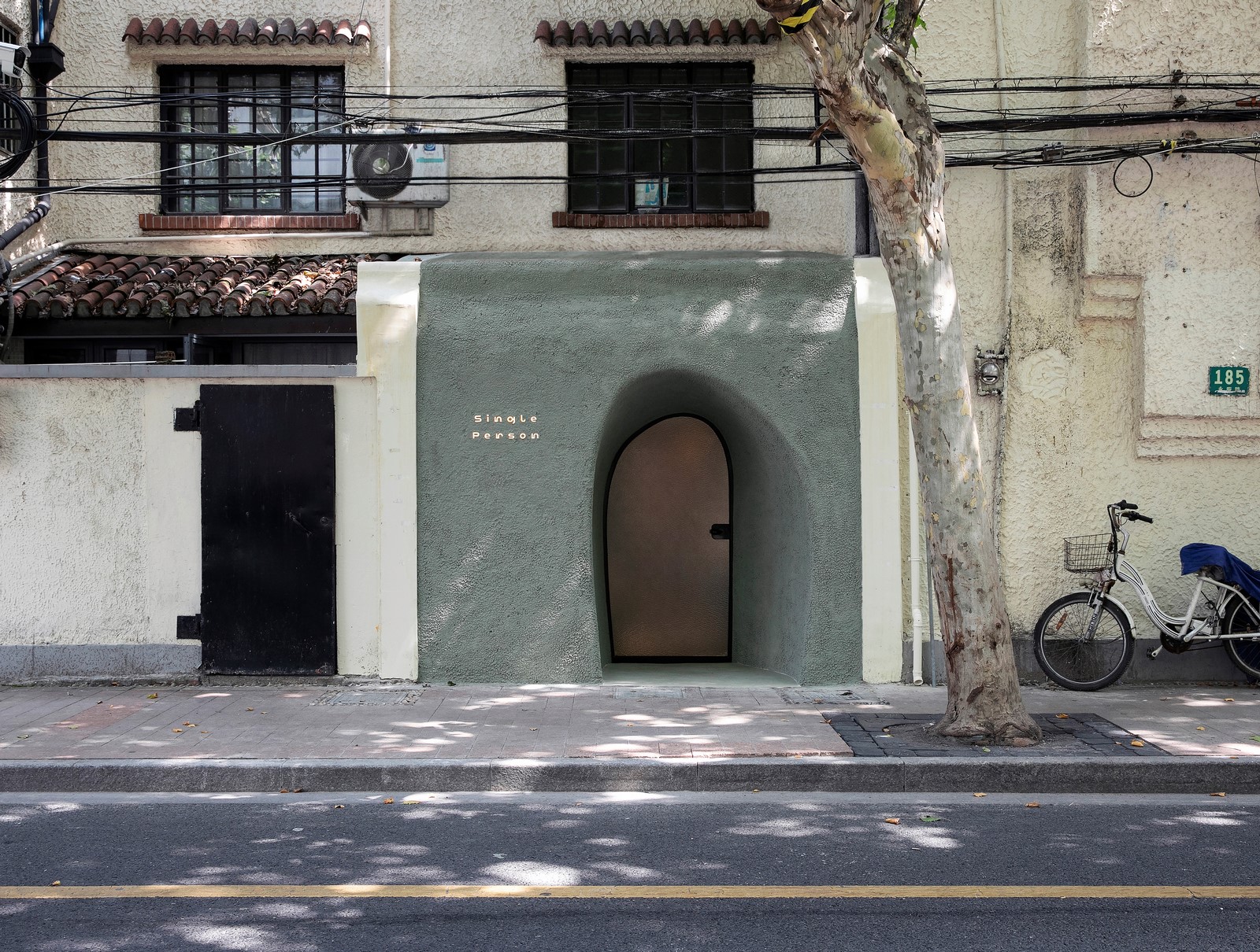
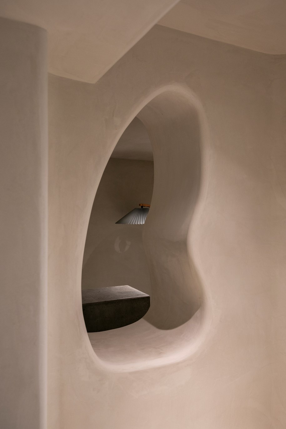
A narrow space with light sources only at both ends, isn’t it a cave?
“The word CAVE broke into our mind when we first sought to define the space as a whole. And because of the space shares similar physicality with cave, while we were verifying this concept, we realised that CAVE is not an imposed concept but manifested by the nature of the site itself. It is found on its physical reality. It is a true argument”, Offhand Practice explains.
“The word CAVE broke into our mind when we first sought to define the space as a whole”.
– Offhand Practice
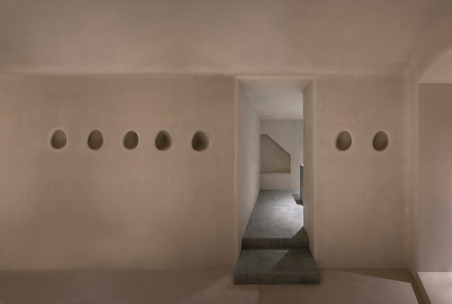
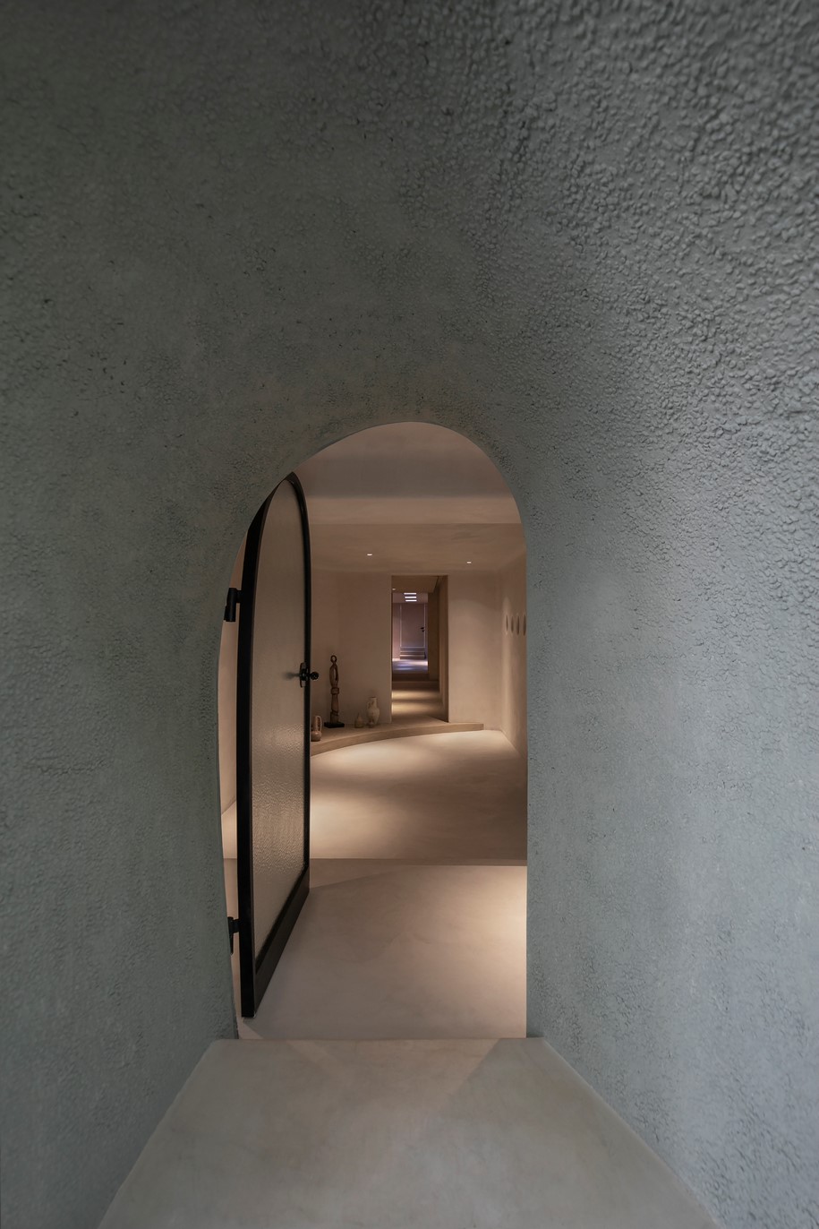
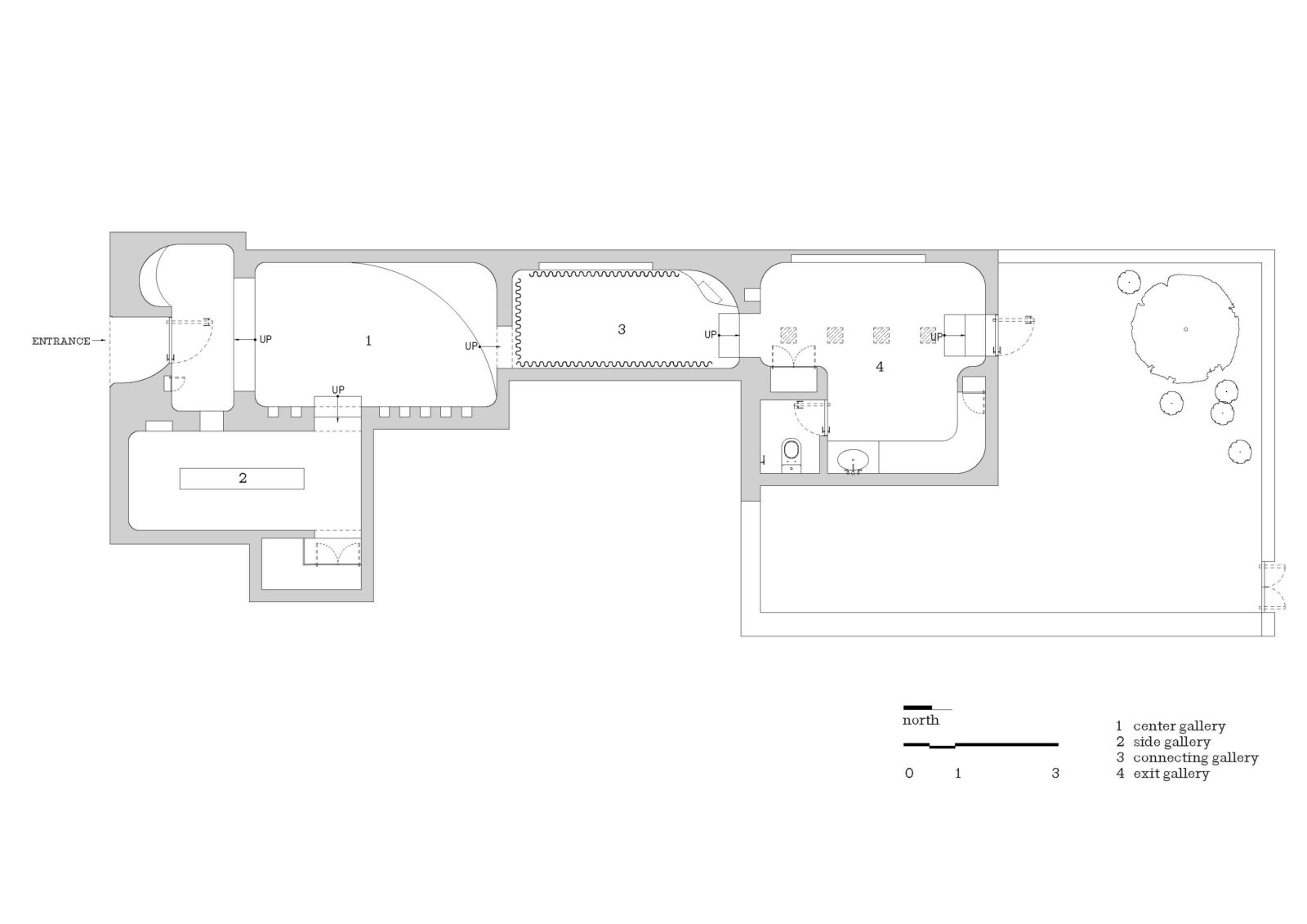
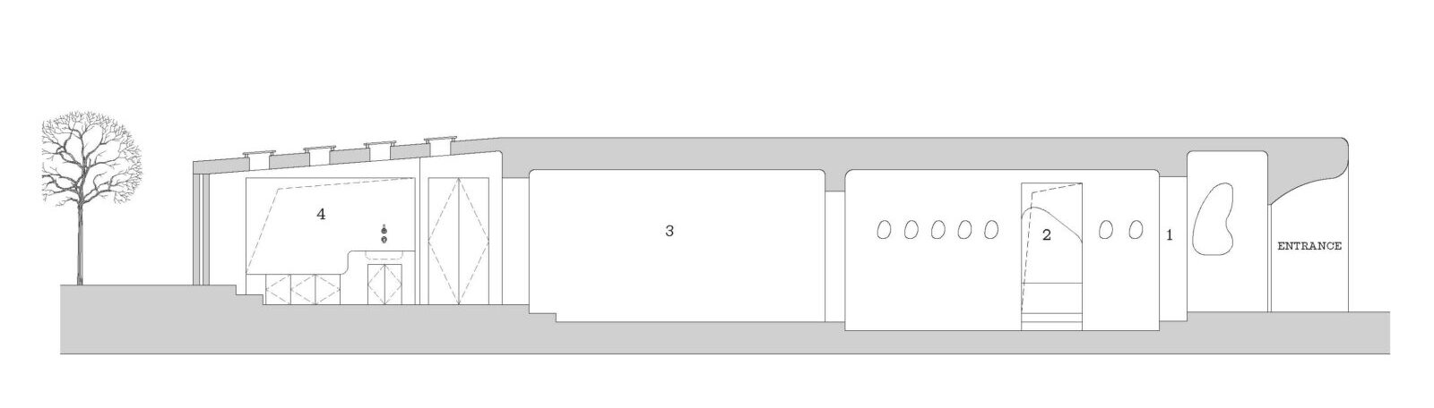
Once the architects came up with the concept, they started defining the design language of the specific elements. The team researched cave itself and cave related design. The existing structural walls divided the space into four individual cave-like rooms.
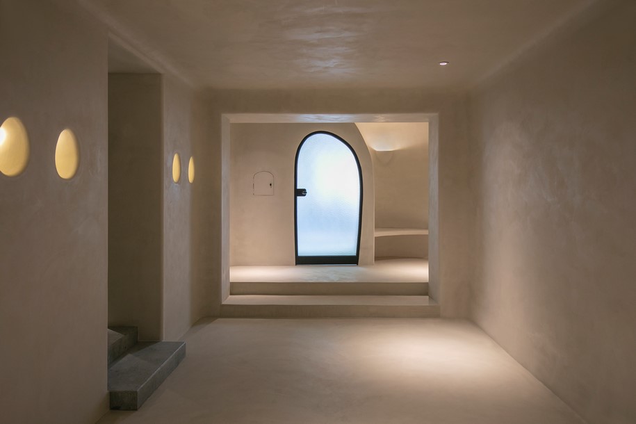
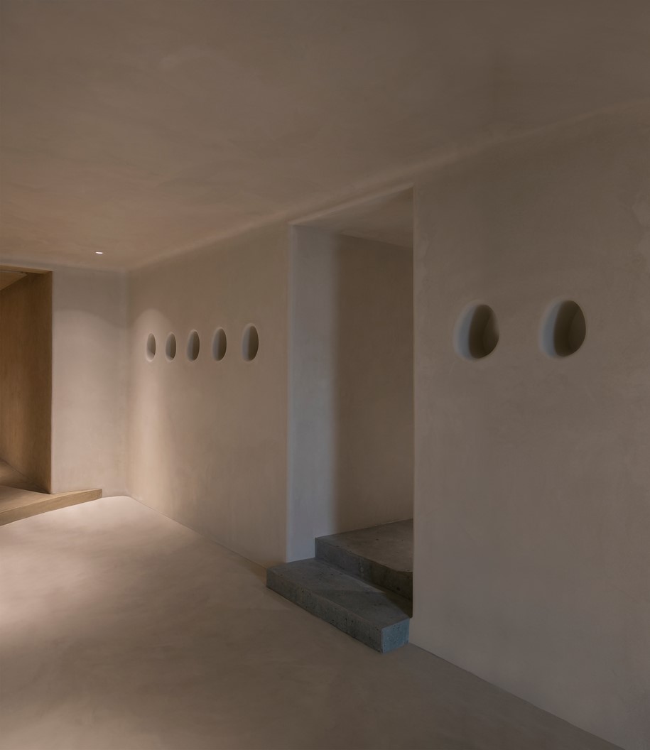
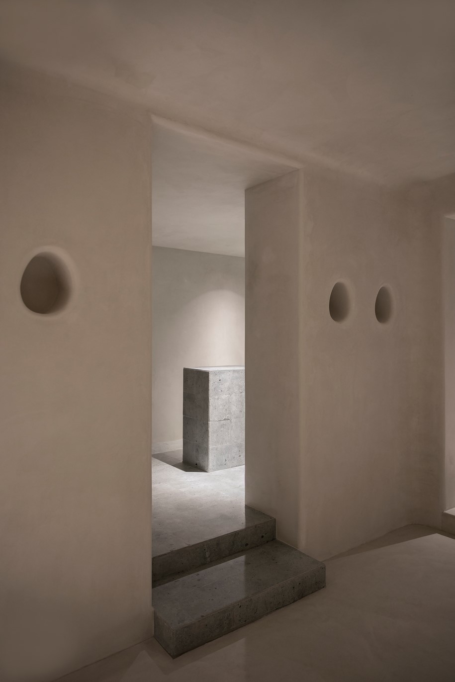
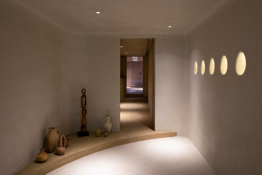
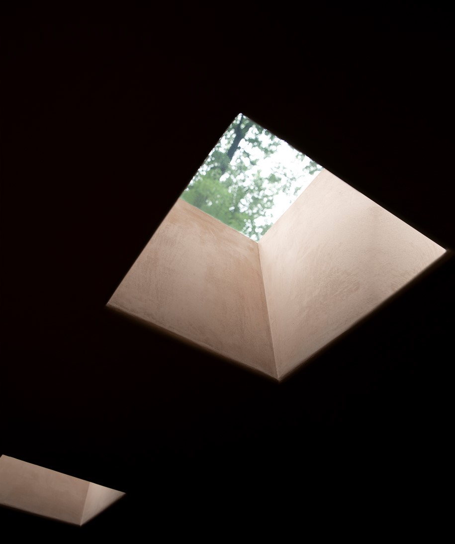
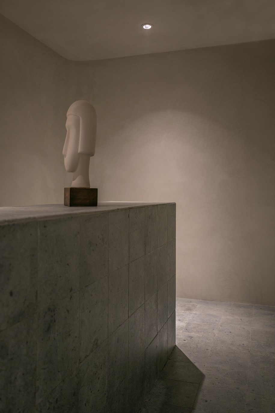
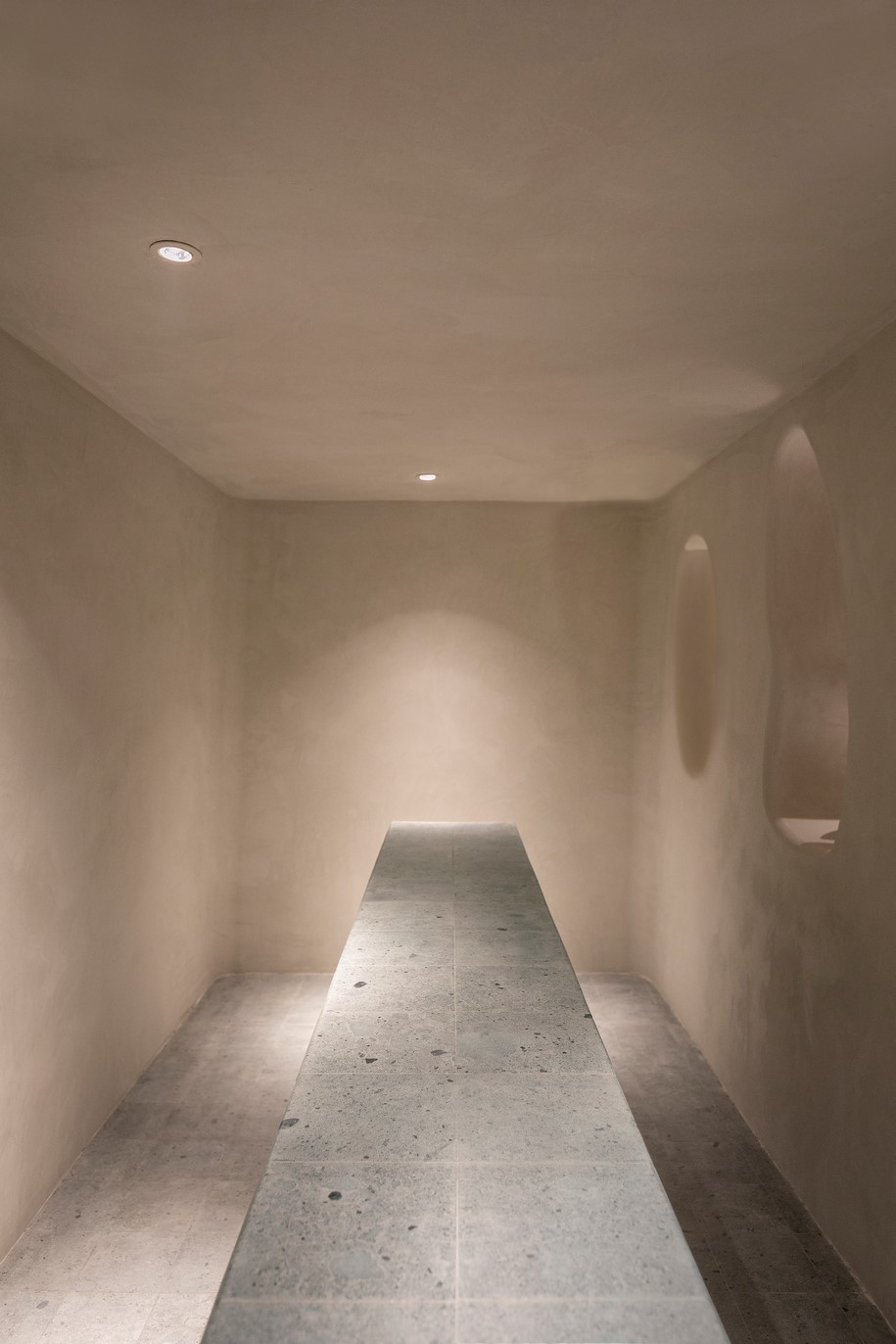
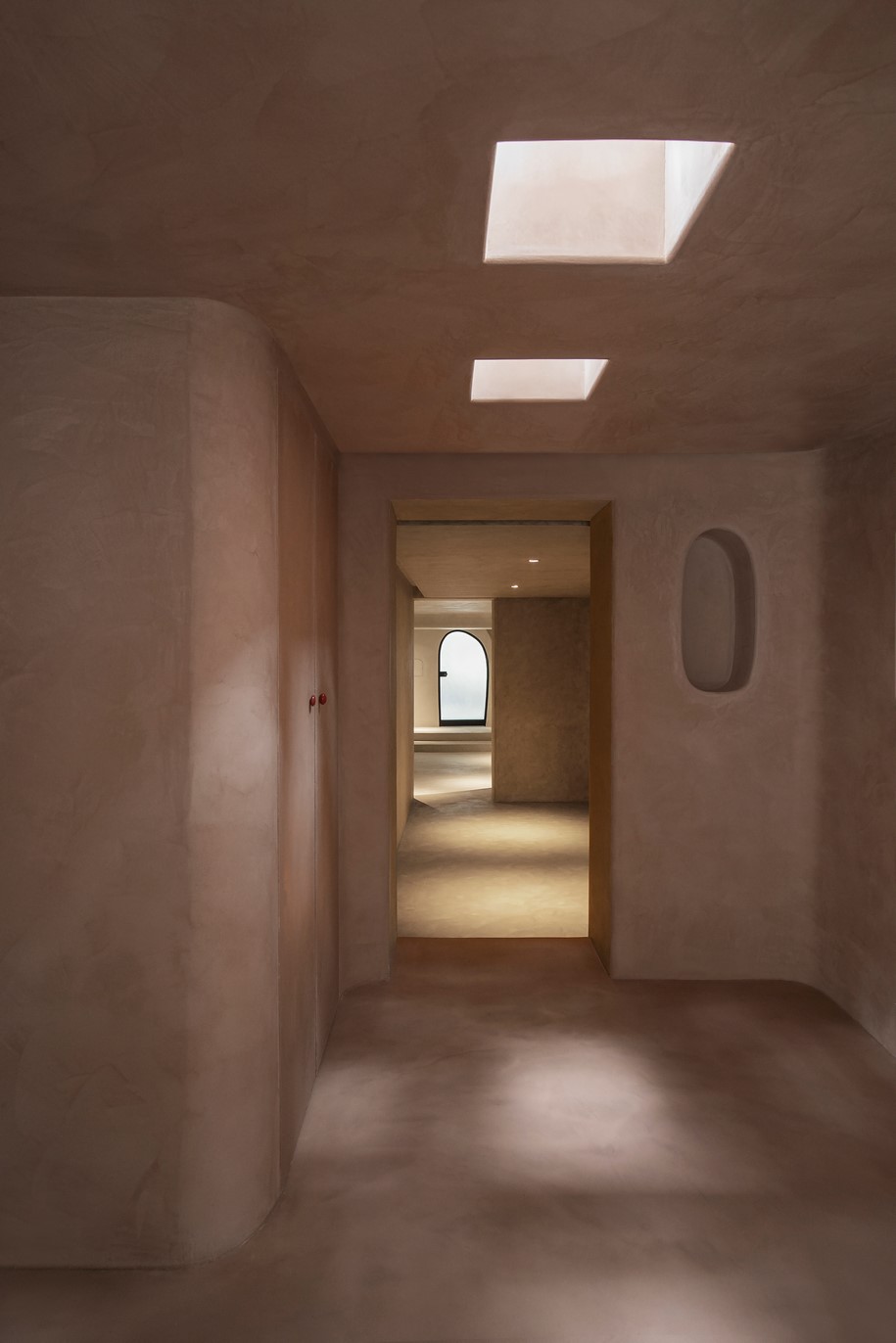
The first site constrain was the lack of natural light in the inner space. In this case, openings on walls are applied throughout the entire space to create indirect lighting sources. A row of small niches was created along the wall of centre gallery, to bring out a candle lighting ambience in the space. An irregular peeking window is punctured for visual connection between centre gallery and side gallery. As for the exit gallery, a row of skylight is designed to guide the visitors out of the cave.
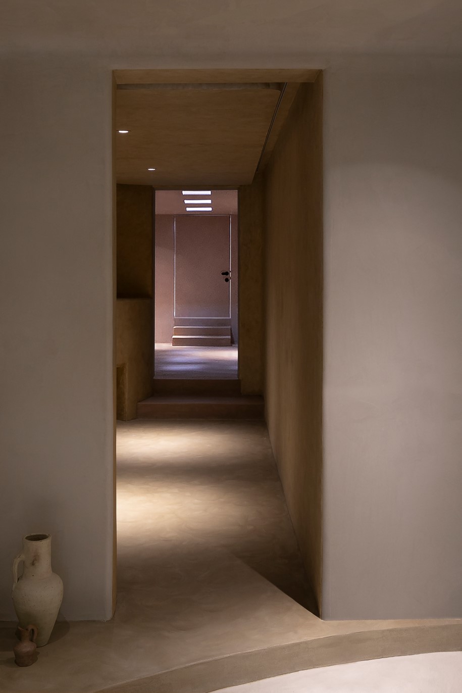
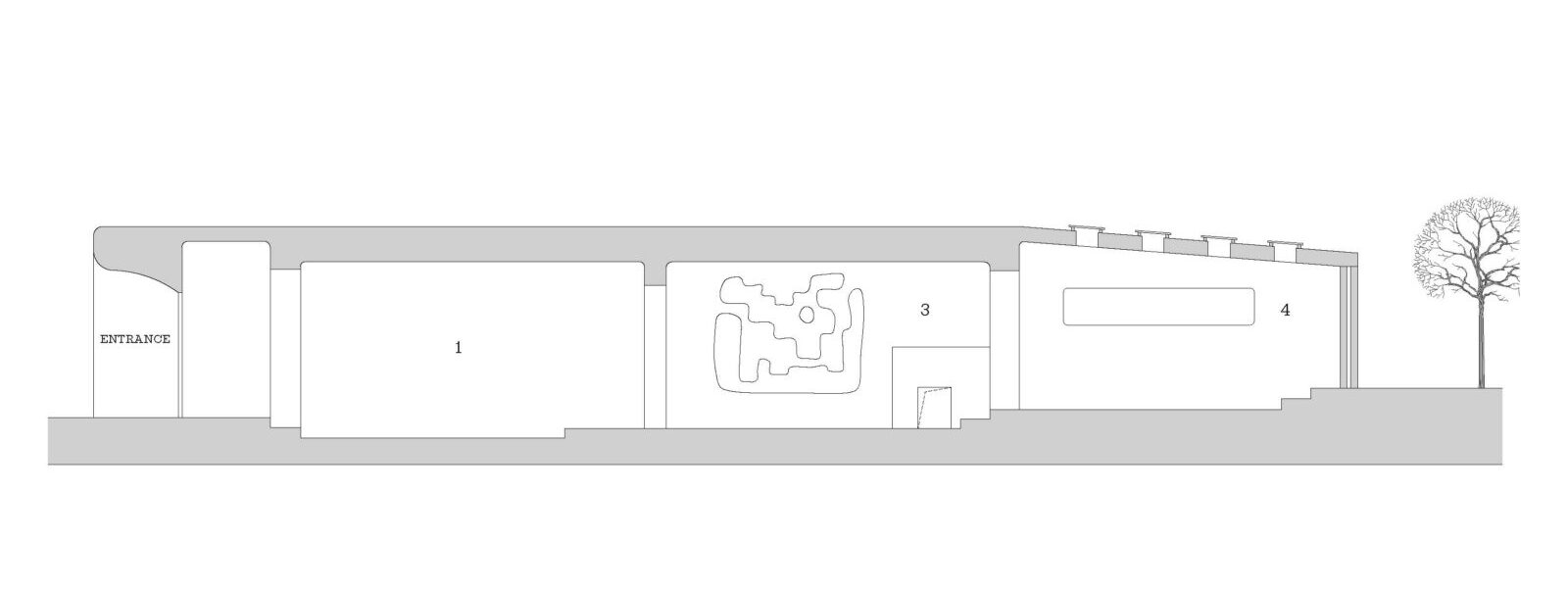
Under CAVE concept, the skylight is given a great vertical depth to simulate the way light penetrates through thick cave walls. By controlling the way light enters, it magnified the experience of a cave.
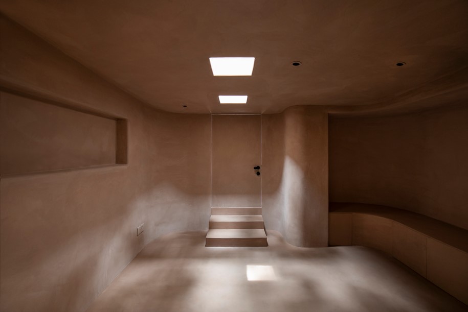
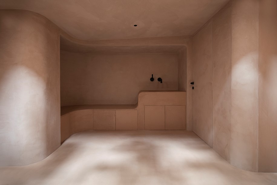
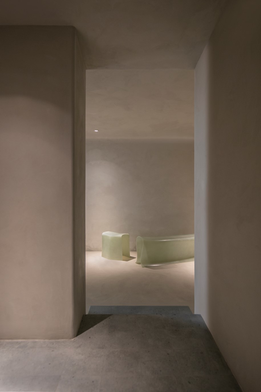
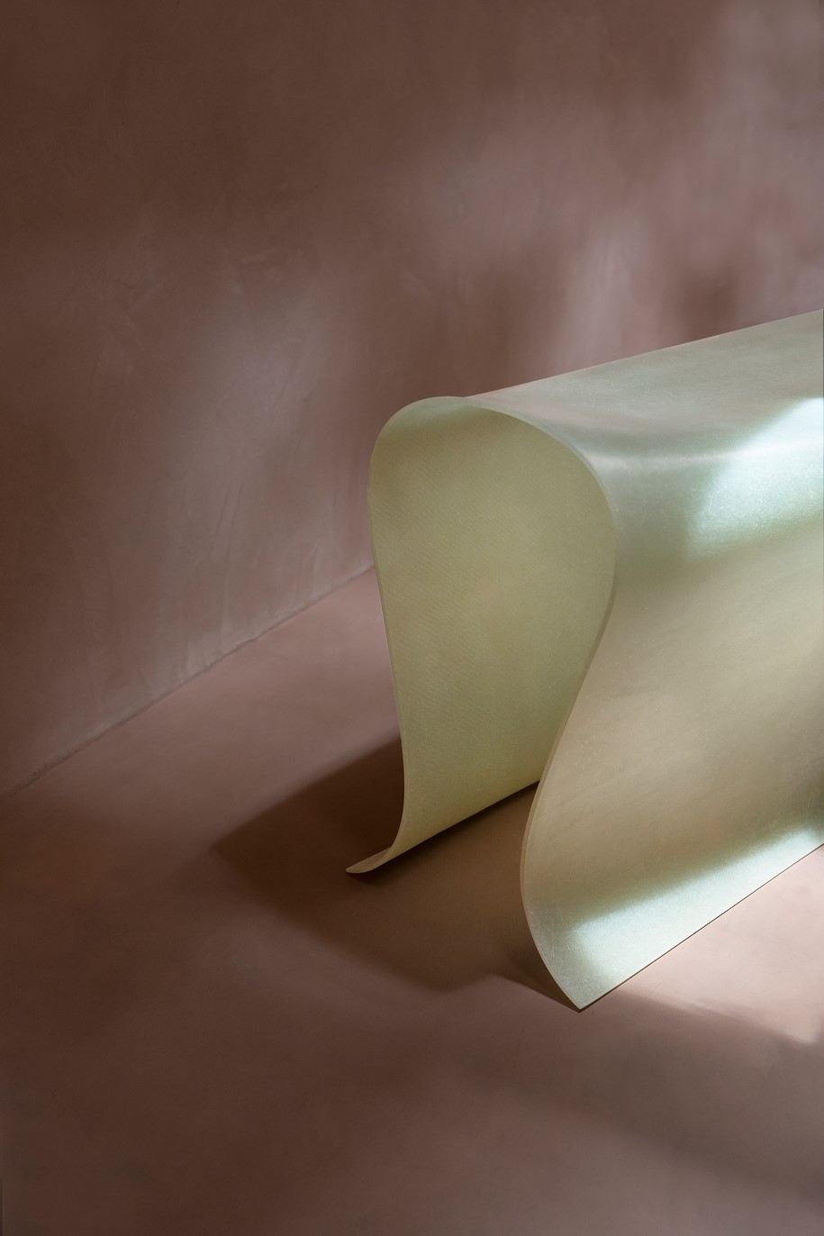
Another feature of the site is the spatial hierarchy. As showing in the elevation, each room is placed on different level. “Since the original civil structure cannot be changed, we decided to take advantage of the height difference between each space, to highlight the depth and progressive level of a cave”, say the architects. Flooring colour that is continued on steps thrusted into the adjacent space, thus created an infiltration gradient between two areas. The curve platform in the centre gallery is in response to the client’s request for an independent merchandise stand.
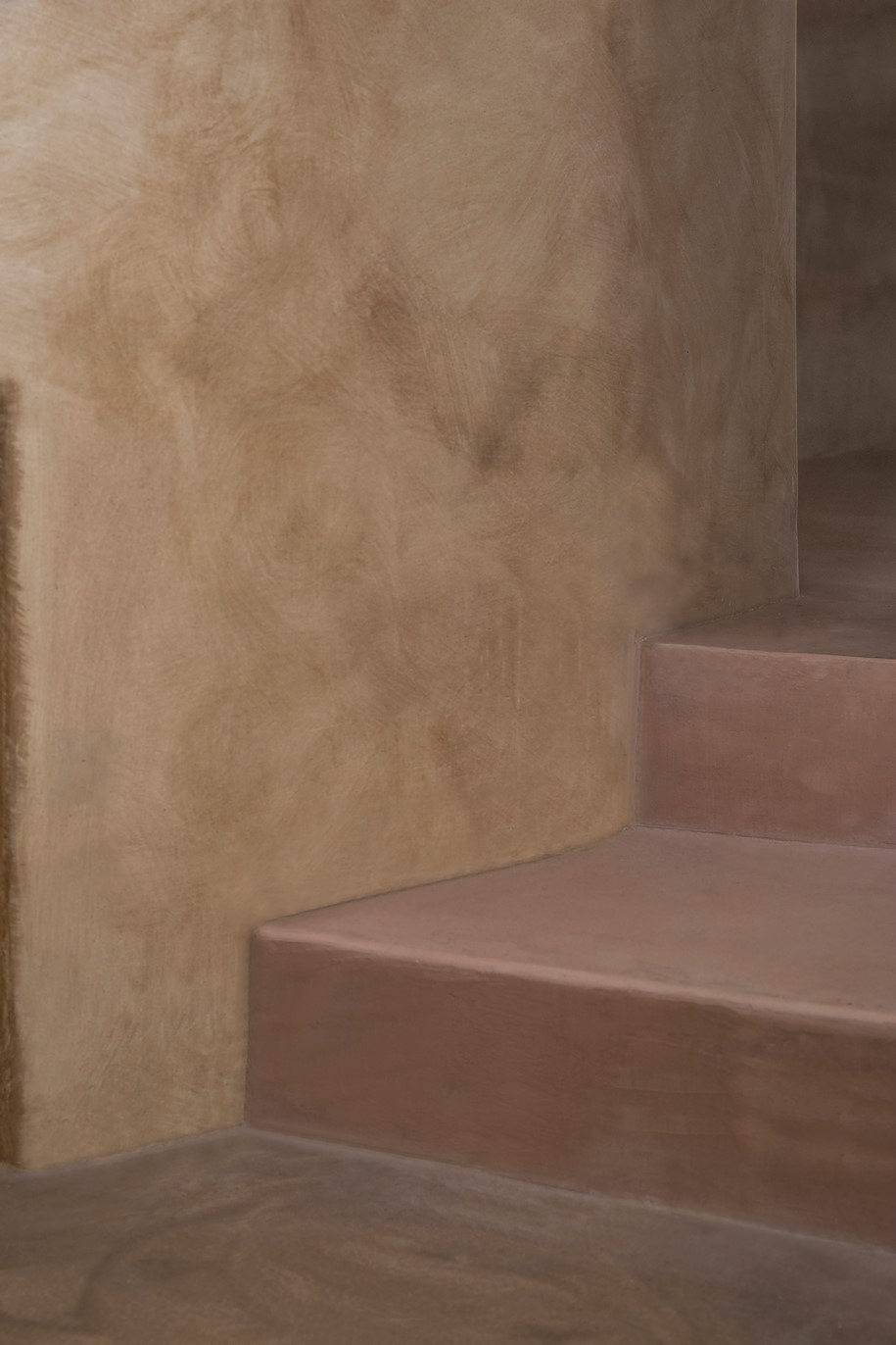
Apart from using height difference to indicate space, different shades of colour is applied to show further emphasis on the depth.
The first area, including centre gallery and side gallery, is in white enamel. The second area, the corridor gallery is in ochre with darker shade, while the last area, the exit gallery is in sienna, the darkest shade of all. Using earthy colour is a natural inclination under the concept of CAVE. The lightness of shades is to indicate the physical attributes of the cave, where the light is dimmed, and the space is darkened after going deep into the cave.
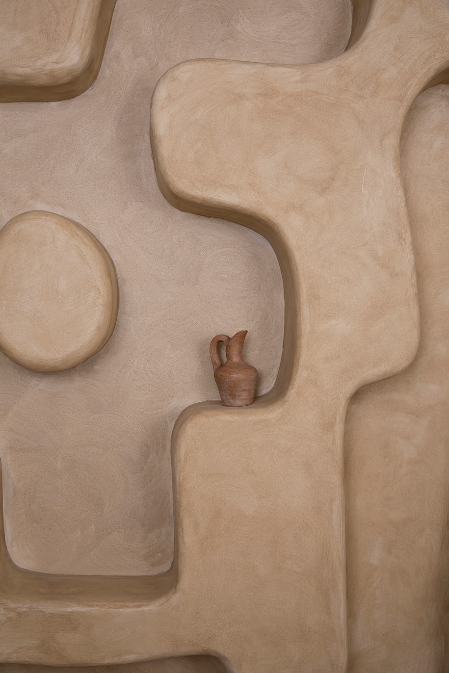
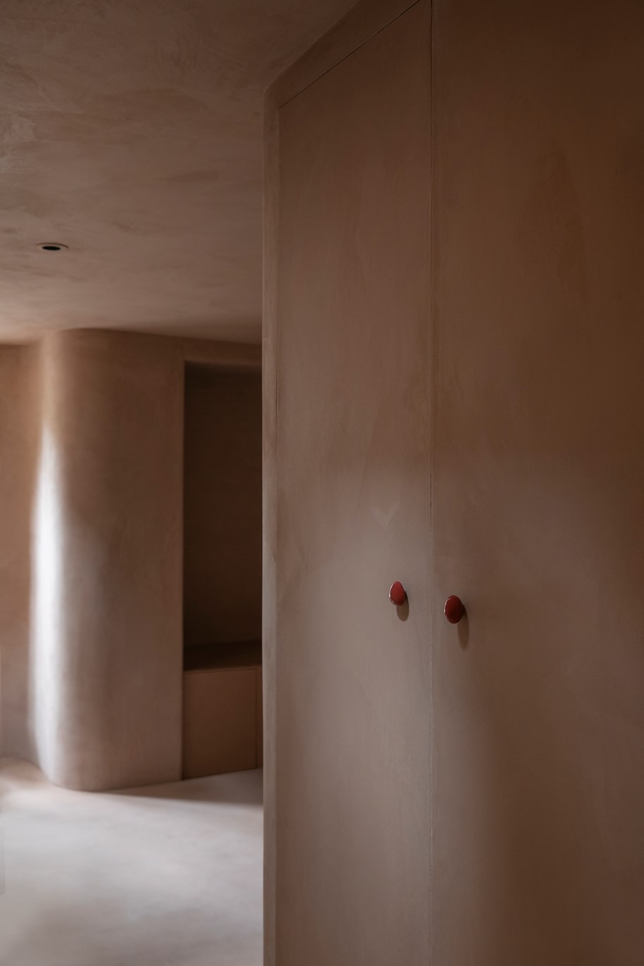
Pebble-shaped antique ceramic door handles, sourced from a Berlin flea market, have been used throughout the space.
Regarding the faucet, the team admits “there was no clue at the beginning, we were not sure what kind of faucet could match the space. Fortunately, our designer stumbled upon a brand called Jee-O on the SketchUp warehouse. We found out that the nearest supplier was in Hong Kong, and after a long process we succeeded in receiving the faucet”.
Besides colour, paint texture is also varied in each room to bring subtle contrast in spatial experience.
“Our contractor is so proud of the arc of the façade, he even took a selfie with it. The texture of façade looks similar to stucco but is actually a result of pebble wash!”.
Single Person is a cooperative effort between Offhand Practice and the client.
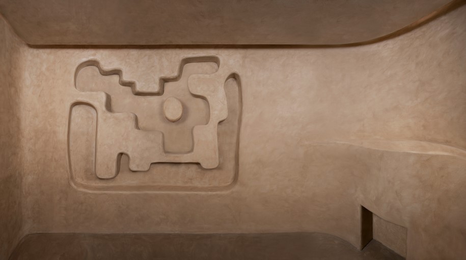
Offhand Practice tells us “The maze niche of corridor gallery is made directly out of the client’s sketch. So does the irregular window in the centre gallery. As more oval shaped details were added in the space, we gradually changed all wall intersections detail into curved ones”.
Plans
Facts & Credits
Project title Single Person
Architecture Offhand Practice
Year 2019
Location 185 Yongkang Road, Shanghai