Όταν η Makt προσέγγισε την Semiotik Design Agency, διένυε ήδη την τρίτη δεκαετία επιτυχημένης λειτουργίας στον κλάδο του real estate development, με ένα ευρύ πολυεθνικό πελατολόγιο και σημαντικά έργα μεγάλης κλίμακας στο ενεργητικό της.
Όντας early adopter και συνειδητά πρωτοπόρος στην υιοθέτηση και εφαρμογή νέων τάσεων, όχι μόνο στο επαγγελματικό της πεδίο δράσης, αλλά σε κάθε χώρο που άπτεται των δραστηριοτήτων της ευρύτερα, η εταιρεία διέθετε εταιρική ταυτότητα, αλλά και online παρουσία ήδη επί σχεδόν 15 χρόνια. Ωστόσο, η εταιρική εικόνα, λόγω παλαιότητας, είχε αρχίσει να λειτουργεί ως παθητικό στο added value του brand. Στο πλαίσιο της διαρκούς αξιολόγησης της πορείας αλλά και του συνολικού της αντίκτυπου, η Makt αναγνώρισε αυτή την αδυναμία και προσέγγισε το ζήτημα όπως κάθε άλλο project της: με οργάνωση, μεθοδικότητα και ξεκάθαρο όραμα.
Τα design values που χαρακτηρίζουν το έργο της Semiotik ταυτίζονται με τις αξίες πάνω στις οποίες έχει χτίσει τη δραστηριότητά της η Makt: απλότητα, αποτελεσματικότητα, έμφαση στη μετουσίωση ενός δημιουργικού οράματος σε λειτουργικό και αποδοτικό αποτέλεσμα. Αυτή η σύγκλιση νοοτροπίας και αξιακής προσέγγισης δημιούργησε εξαρχής τις ιδανικές συνθήκες για την εδραίωση μιας κοινής αντίληψης και δημιουργικής συμπόρευσης στον σχεδιασμό ενός νέου brand identity.
Το ζητούμενο ήταν η δημιουργία μιας ταυτότητας που να εκφράζει επιτυχώς το σήμερα της εταιρείας, και ταυτόχρονα να επικοινωνεί την προοπτική της για το μέλλον.
Η μεθοδολογία της Semiotik στηρίζεται στη διεξοδική και εις βάθος έρευνα, ως βάση για την ανάπτυξη της συνολικής προσέγγισης κάθε έργου και των επιμέρους σχεδιαστικών concept. Στην περίπτωση της Makt, η διερεύνηση αυτή είχε ιδιαίτερη σημασία, διότι επέτρεψε την ορθή κατανόηση της σύνθετης φύσης της δραστηριότητάς της, αλλά κυρίως οδήγησε στην αναγνώριση του τρόπου με τον οποίο η εταιρεία επιλέγει να κινείται μέσα σε έναν πολύ ανταγωνιστικό κλάδο: με σοβαρότητα, ακεραιότητα, και προσήλωση στον στόχο της.
Αναγνωρίζοντας ότι σημαντική ιδιαιτερότητα στο συγκεκριμένο project αποτελεί η πολύπλευρη φύση του αντικειμένου της Makt, και έχοντας κατανοήσει την ουσία αυτής της πολυπλοκότητας, το design team της Semiotik οδηγήθηκε στην υιοθέτηση δυναμικών, αφηρημένων γραμμών προκειμένου να εκφραστούν τόσο οι βασικές αξίες, όσο και η δυναμική και ανοδική πορεία της εταιρείας. Ο συνολικός σχεδιασμός είναι δομημένος με έντονη γεωμετρία, αντικατοπτρίζοντας την κυριολεκτική και μεταφορική δομικότητα του κλάδου του real estate. Ταυτόχρονα, η καθαρότητα και αυστηρότητα των γεωμετρικών γραμμών εκφράζει συμβολικά την ακεραιότητα και το αυστηρό business ethic της εταιρείας.
Ο μελλοντοστραφής προσανατολισμός και η φιλόδοξη οπτική της Makt συμπεριλήφθηκαν ως βασικά στοιχεία του concept development και μετουσιώθηκαν στον σχεδιασμό μέσα από φιλόδοξα στοιχεία όπως τα βέλη και το φωσφορούχο κίτρινο χρώμα, που λειτουργεί ως accent σε μια αυστηρή χρωματική γκάμα του γκρι.
Η νέα ταυτότητα συνοδεύτηκε και από τη δημιουργία ενός νέου tagline, με στόχο να επικοινωνήσει έμμεσα αλλά αποτελεσματικά το στίγμα της εταιρείας. Η φράση “the future in development” λειτουργεί σε διαφορετικά επίπεδα, παίζοντας με την έννοια του development ως περιγραφή του κλάδου δραστηριοποίησης της εταιρείας και ταυτόχρονα ως έκφραση της ευρύτερης έννοιας της ανάπτυξης ως εξέλιξης, δημιουργικής πορείας προς τα εμπρός.
Στο πλαίσιο του σχεδιασμού και της κατασκευής (development) του νέου δικτυακού τόπου της εταιρείας, η ομάδα της Semiotik ανέλαβε και την επιμέλεια του περιεχομένου, καθώς επιδιώκει πάντα να παρέχει την πιο ολοκληρωμένη γκάμα υπηρεσιών αλλά και να συμβάλει στη σωστή εφαρμογή της νέας ταυτότητας σε όλες τις εκφράσεις του brand.
Το νέο brand identity της Makt λειτούργησε εξαιρετικά θετικά από τους πρώτους μήνες της δημοσιοποίησής του, αντλώντας θετικά σχόλια από συνεργάτες της εταιρείας αλλά και ενισχύοντας τη θετική ανταπόκριση και το engagement νέων επαφών. Επιπλέον, απέσπασε τιμητικό έπαινο στα Ελληνικά Βραβεία Γραφιστικής και Εικονογράφησης (ΕΒΓΕ) 2018.
Credits
Ανάθεση Makt
Υλοποίηση Semiotik Design Agency
Έργο Identity development, website design
Έτος 2017-18
–
The future in development: New identity for MAKT SA
When Makt SA reached out to Semiotik, it was already in the third decade of successful operation in the real estate development sector, with a broad, multinational client roster and important large-scale projects on its record.
Being an early adopter and conscious pioneer in implementing new trends, not just in its professional sector but in every field that is broadly related to its activities, the company already had a corporate identity, and an online presence dating back almost 15 years. However, its corporate image had grown “old” and was becoming a liability against the brand’s added value. Within the framework of continuous assessment of the company’s progress, as well as its overall impact, Makt recognized this weakness and approached this issue in the same way as any other project: methodically, with a well-organized plan and a clear vision.
The design values that define the work of Semiotik coincide with the values that form the foundation of Makt’s activities: simplicity, effectiveness, emphasis on transforming a creative vision into a functional and efficient outcome.
From the beginning, this convergence in mentality and value approach created the ideal circumstances for the establishment of a shared perception and common creative progress in the design of a new brand identity. The goal was to create an identity that successfully expresses the company’s present, and at the same time communicates its potential for the future.
Semiotik’s methodology is based on thorough and in-depth research, as the foundation for the development of its comprehensive approach to each project and individual design concepts. In the case of Makt, this investigation was of particular importance, because it allowed for the proper understanding of the complex nature of the company’s object of business, but mostly because it led to a recognition of the way in which the company chooses to navigate a very competitive industry: with determination, integrity and dedication to its goals.
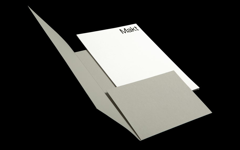
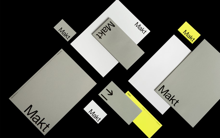
Having acknowledged that the complex nature of Makt’s object of business constitutes an important element of this project, and having understood the essence of this complexity, the Semiotik design team was led to adopt dynamic, abstract lines to express both the company’s core values and its dynamic, upward trajectory.
The overall design is constructed with strong geometries, as a reflection of the literal and metaphorical structural nature of the real estate development industry.
At the same time, the clean, austere geometry of the lines symbolically expresses the company’s integrity and overall business ethic.
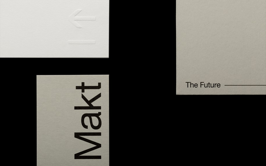
Makt’s orientation to the future and its ambitious perspective were included as essential elements in concept development and transformed into design through aspirational elements such as arrows and a neon yellow color, which functions as an accent in an otherwise severe color palette in shades of gray.
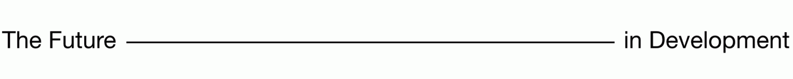
The new identity was accompanied by the creation of a new tagline, intended to communicate the company’s essence indirectly yet effectively. The phrase “the future in development” works on different levels, as a play on the concept of development as a description of the company’s industry, and at the same time as an expression of the broader meaning of development as evolution and creative forward progress.
Within the framework of designing and overseeing the development of the company’s new website, Semiotik also curated its content; the agency always seeks to provide the most comprehensive set of services, and also to contribute to the proper implementation of the new identity in every expression of the brand.
Makt’s new brand identity was exceptionally effective from the first months after its launch, drawing very positive feedback from the company’s associates and also strengthening positive responses and engagement with new leads. The new brand identity was also awarded an honorable mention at the Greek Graphic Design and Illustration Awards (EBGE) 2018.
Credits
Client Makt
Implementation Semiotik Design Agency
Project Identity development, website design
Year 2017-18